Photo Challenge 2023 Judging
Whalley Village 1 The Village of Whalley one of the most picturesque in the Ribble Valley. Your challenge here is to capture an aspect of the village that shows this. Wander round and find the perfect view of the village. Consider the way you would want to capture this. Consider the architecture, floral displays and the setting ie Whalley Nab. What I want to see is Whalley at its idyllic best. I know Whalley well so will have high expectations!
- Team 1
- Team 2
- Team 3
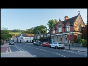
This is a wide angle view of Whalley looking towards the Nab. The positives about this image is that its sharp, correctly exposed and F8 has given some depth of field. How can it be improved? Parked vehicles dominate the scene, The view point shows lots of road markings (lower angle?), the use of a wide angle has the effect of flattening out the Nab. In reflection I am sure you recognise that there are many better views of Whalley that could have been used. 13 Points.
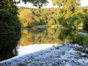
This is a view looking up the Calder showing the Weir and a Tern. This images strengths are its composition – the framing- this uses foliage form a tree to frame the point of interest, the angle of the Weir takes you into the image and its main point of interest which is the Tern perched on the Weir, the depth of field has thrown out the background but not so much as to completely blur it out. Looking at how this image could be improved, I would only suggest a slightly lower view point which would hopefully allowed the tern to be in the shaded area reflected in the river. 15 Points.
Lorem ipsum dolor sit amet, consectetur adipisicing elit. Optio, neque qui velit. Magni dolorum quidem ipsam eligendi, totam, facilis laudantium cum accusamus ullam voluptatibus commodi numquam, error, est. Ea, consequatur.
Whalley Village 2 :- Challenge 2 is about the historic architecture in the village. Subjects if interest are the Church, Abbey views, the Gatehouses, viaduct, Old School and some of the old building within the village. Submissions can be straight record shots or something involving manipulation to create an image that shows historic Whalley.
- Team 1
- Team 2
- Team 3
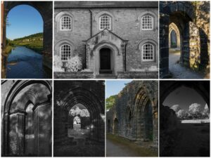
This is a really nice composite that uses scenes of and around the abbey and the Viaduct. Each of the images could have been entered individually. It uses 7 images which when arranged as they are gives a really balanced feel. It’s a mix that meets the challenge and uses B/W Infrared . I did want to check to see how this projects ( and see if the framing lines are consistent). 17 Points
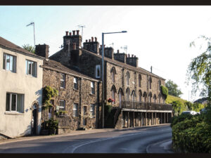
These are the row of cottages going out of Whalley. I have photographed them myself (it’s a daytime shot to avoid parked cars). The problem with cars shows itself on the right hand side of the image. The image meets the brief, its sharp but the exposure for the evening light is bright and the sky details are limited. I would have liked to see this rendered in B/W with contrast- and from a slightly different viewpoint. Also, that lamp post should be chopped down! 14 Points
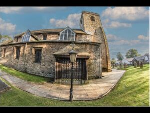
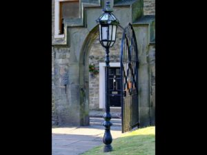
The fish eye- I can’t say it’s a one trick pony (it isn’t) and there is another entry later on using the fisheye. The Fisheye Lense was first developed in 1906 with the aim of understanding how fish see. Its use then seems to disappeared until the 1960s when it became used, particularly in the music industry- the Who, Jimi Hendrix Experience album covers. Also in video…..who can forget the Beasty Boys video for “shake your rump”. The strengths of this image are, it uses the distortion along the horizontal plane, the colour palette gives the image a dynamic feel and the central focal point. If I wanted to improve the image I would have moved the camera millimetres to the right, so the lamp post lined up with the porch detailing. 16 Points
The River Calder :- The river runs through Whalley and there are many places in and around the village that offer positions to photograph it from, ie the bridges, road and foot bridge under the Viaduct, the Abbey, upstream form the village or using the vantage point of Whalley Nab. Your challenge is to find a vantage point that gets you an engaging image. The less obvious will probably be the most appreciated!
- Team 1
- Team 2
- Team 3
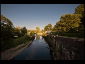
This is a view up the river Calder. The wide angle lens used has distorted what the human eye would see (I struggled at first to recognise the scene). Most of the scene is in shadow, which is a shame and this is exaggerated by the wide angle. I think that a 50 mm lens would have brought the interesting parts of the image closer and negated the area in shadow. 13 Points
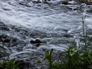
This is a wonderful image ! A long exposure with 2 otters- This image is the product of the camera being set up for a different type of shot then suddenly the Otters appeared. The photographer took shots probably knowing they would not please the wildlife judge, but it really pleases me. The camera settings of 100 iso, 1/5 sec exposure and f16 suggest that the photographer was probably looking for a scene on the Calder. When you zoom in the image improves but at cost of losing the foliage which gives an interesting counter point. Enter this in a club competition and see what another judge thinks. It is my favourite image of the challenge entries. 20 Points.
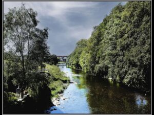
. This is the image of the Calder that I expected to receive. It is the opposite view to the image we have viewed looking up the river. It a nicely constructed image with an interesting colour palate and the viaduct is framed nicely by the sky and woodland. NB CHECK THIS IMAGE WHEN PROJECTED. 17 Points.
1900 :- There are many parts of Whalley that date from 1900 or before. Your challenge her is to give me an image that shouts, “this was taken in 1900”. To do this you will need to find a subject looks period, probably this will be architectural. Get a good image to start with! Then look at processing skills and how you can use these to give the image a period feel. The more convincing the more points you will get, whilst the presence of non-period details (street furniture/markings etc) will lose points!
- Team 1
- Team 2
- Team 3
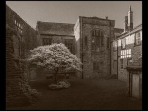
This image was taken at the back of the Abbey. The subject was undoubtedly there in 1900 so no intrusive bits of the modern world to remove. The image is B/W but the problem with this image is that shaded so no details of interest apart form the tree which looks to be unnaturally bright in the circumstances, Is it an infrared image? 12 Points.
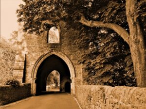
This team have used a sepia finish to make it look period. By 1900 film development still commonly used a sepia tone to fix the images and this method remained in use but not universal until the 1930’s, by then alternative fixers had been developed to allow pure B/W prints to be made.
Again, the gatehouse was there in 1900 so no tidying up to do. The tree frames the image nicely. Question the sky blown out as are parts of the stonework on the left hand side. This is exactly how a period camera would have performed and “burning in”. A good image that meets the challenge. 16 Points.
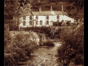
This image has also used a Sepia tone. Again, I suspect that the building which is the subject was around in 1900 but was any work required to remover arials etc and they may well have been present. The lead to the house provided by the river to the house give the image some structure which works well. 16 Points.
Posing a model :- Working with models is something that has been available at club nights on several occasions so most of us will have some experience. The task here is to use the model to represent a specific theme or subject. The choice will be yours, but could be, dust jacket portrait on the back of a book, interaction with the photographer or architecture, capturing an activity, behaviour or feeling.
Sounds easy! But the model is me! Your job is to approach me during the evening, and I will give you 10 minutes to direct me. I will do my best to represent your chosen subject, but the pressures is on you to get the type of image that fulfils the challenge. Think setting, lighting and most importantly Pose! Give this image a title. NB I will take note of your brief and see how your work reflects this!
- Team 1
- Team 2
- Team 3
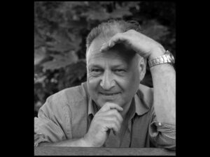
This team chose to go for the close-up portrait. The photographer worker me quite hard and gave plenty of direction to get the desired shot. The use of the hands and arms have a purpose the provide a strong frame to the image whilst allowing the me to shade my eyes from the sun. As a black and white image it does look quite dark- should it be lighter? Also for future reference sort out your model- don’t let them wear a confusing shirt.
Whilst working on this sequence the photographer suffered one of those moments……….the camera stopped working. This can happen for a number of reasons -better for it to happen on a photo challenge than whilst photographing a wedding ! 16 Points.

This image is nicely exposed (again the shirt is a problem). The angled presentation was quite common 20 years ago, the intention to give a bit of drama to an image…….it is still used. This team gave plenty of direction and tried props to get the desired image. 14 Points.
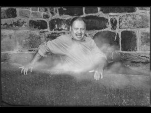
his image exudes………horror! The team directed and demanded “more” from the model to get this image. Having taken the serise of images, this version selected then convered to B/W and the smoke added and teeth worked on. The result is a real house of horror take on the Vampire theme.
There is a moral issue in this image which I raised with the team. It involves the use of an ancient stone sarcophagus. Recently in the press a number of stories have run where inappropriately clothed models had been photographed in religiously sensitive places. This sarcophagus has been in situ for many years and often children play in it… The team considered this and made the decision to continue. 19 Points
Details :-This challenge is to use details in an image- it’s not just about using a macro-Lense to get a close up! I want to see some photo thinking at work. Consider use of depth of files to isolate/include, framing, layers, reflections, facial detailing and any other creative ideas you may have. Your task is to give me a Detail image that has real punch!
- Team 1
- Team 2
- Team 3
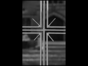
This is a nice image. With very little information this religious detail jumps out. The cross motif is well lit which makes it pop out whilst the background which is thrown out by a shallow depth of field gives sufficient information to confirm the religious nature of this “detail”. 17 Points.
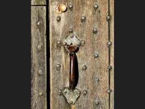
There are so many textures in this wonderful door handle. The grain, nails and patina of the metal are all points of interest. The image is sharp, and the details stand out. The brass key cover really sets of this image of detail. 16
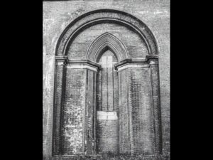
A different approach to detail. The impressive brick work on the viaduct has many details to enjoy. The use of Black and white cuts out any distractions that may have been there and enable the viewer to focus on the ornate brickwork. I suspect that this image was taken from the western side of the viaduct which has allowed for good lighting by the evening sun. 16 Points
Weather conditions:- We can’t predict the weather in advance! The one thing we do know is that there will be “weather”! To do well in this challenge your expected to capture an image that shows something about the weather on the day, this could include a sunset, rain, dramatic cloud formations, shadows or something else weather related. NB conditions will change during the evening. Make the best on any opportunity.
- Team 1
- Team 2
- Team 3
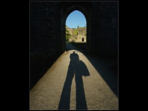
This image tells you so much about the weather conditions. The shadow of the photographers leads you into the image and into the scene beyond the gatehouse. The blue sky seen through the stone arch confirms that they weather was sunny and the photographer’s shadow indicate that the sun is low in the sky- it’s a sunny evening. 17 Points.
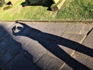
A similar idea to the previous image. The evening of the challenge was wonderfully lit so the photographer here was taking advantage of this. The image uses the line of the curbing stones and the shadow cast by the church to frame the human shadow. Im not to bothered about possible cropping as the area at the top of the image gives some space and balance to the area of interest. 16 Points.
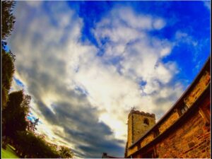
It’s the fish eye again! The saturated colours, Lense distortion and framing by the trees on the left side give the image a surreal yet structured feel. When fisheye lenses are used to look up the effect is particularly disconcerting. The presented image certainly lets us know about what the weather was like in a striking way. 15 Points
Open :- This is the one where you get the chance to impress the Judge! On your evenings photography you will find opportunities that may or may not relate to the other challenges. Your task is to give me an image that shows your skills and creatively at its best, this may be a grab shot, a subject that catches your eye or something showing off your photography or your processing skills.
- Team 1
- Team 2
- Team 3
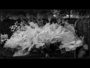
This is an infra-red image that plays to its strengths. Foliage always looks good in I R and this image is primarily foliage. Its lovely to let your eyes wander round the image and soak up the delicate details on the fern fronds. This image really benefits from the pin line framing. It’s a clear and simple image. 18 Points.
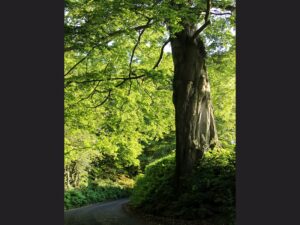
This image looks like it was taken coming down from the Nab. The viewer is invited to follow the line of the road descending and turning to the left. The tree which is the dominant feature has a curious twist in its trunk that gives interest to the image. There is not much in this image- some judges would like a human interest on the road probably in red- that however would be a completely different picture. 13 Points.
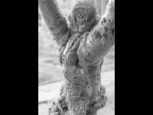
Hmmm this is disturbing! It’s a simple well seen capture of tree growth. This unusual growth takes a human like form, it looks like a man writhing in agony or a man turned into a tree or a tree becoming a man! It’s well spotted and nicely placed in the frame. The use of Black and White and the pin line make the image clean and striking. 18 Points
Grain :- Digital noise gives a similar effect to grain on film images. Often, it’s something photographers want to avoid, but on this occasion it’s something your expected to use! A noisy image can be achieved at capture or in processing (plenty info on how to do this on the internet).
Grain/noise can add much to an image it can give a period feel, particularly on B/W images. It is regularly used in fine art images and give a quality to portraits, architecture and landscapes that give atmosphere and quality. Sensitive use of noise can create an image with a difference but remember, poorly applied noise will not improve an image, just make it look poor!
Your Challenge here is to give me an image that uses Noise to enhance an image. The subject matter is your choice!
- Team 1
- Team 2
- Team 3
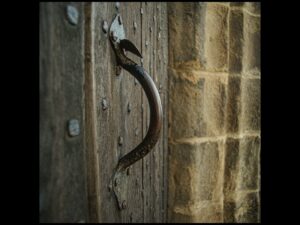
This is the door handle again. Grain/noise has been introduced, but has it done anything other than make the image less clear? When creating a grainy image like will all manipulations it has be to in an attempt to improve the image or give it a certain quality. I think the subject choice limits the use of grain in this case. 13 Points
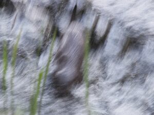
I love this image. I think that it is water, possibly on the weir taken on a long exposure? Has there been some desaturation? I would challenge any judge to say that this image is too noisy. The noise/grain gives the image an ethereal quality. A super use of grain. Hopefully we will see more in the Club! 18 Points
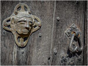
In most respects what I said about the door handle image is true of this image- it’s a similar subject. Does Noise/grain have a positive role in this image, I don’t think so.
13 Points
End of the day :- Towards the end of the evening the light will change as will subject matter, also different venues may be available (pub interior?). Your challenge her is to capture the end of the day. Imagination, photography shills and processing skills will all be used to meet the “end of the day” challenge.
- Team 1
- Team 2
- Team 3
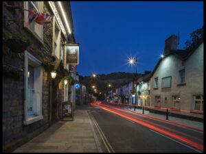
This lovely image creates a narrative. It’s a sharp clear low light image with a long exposure (10 secs) which allows the light trails. It looks like somebody is “going home at the end of the day”. 17 Points
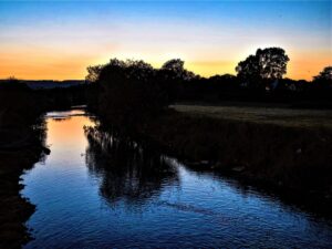
This image is literally “the end of the day”. It’s about 10 minutes after the sunset. The image is looking down the Calder from the Bridge in Whalley. With no light from the sun the landscape is dark, 10 minutes earlier and this would have been lit up and a more interesting image would have been possible. 13 Points
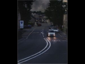
This image also has a narrative. The vehicle, with its lights on, is leaving the village at the “end of the day”. Is the colour desaturated to give a subdued palate or is it a natural result of the low light? I checked th eimage info- it tells be that a flash was used! Did this distract the driver? Bet he checked his speed.
The pin line sets of th e image particularly nicely. 16 Points
Final Scores
- Team 3 163 pts
- Team 2 155 pts
- Team 1 135 pts
